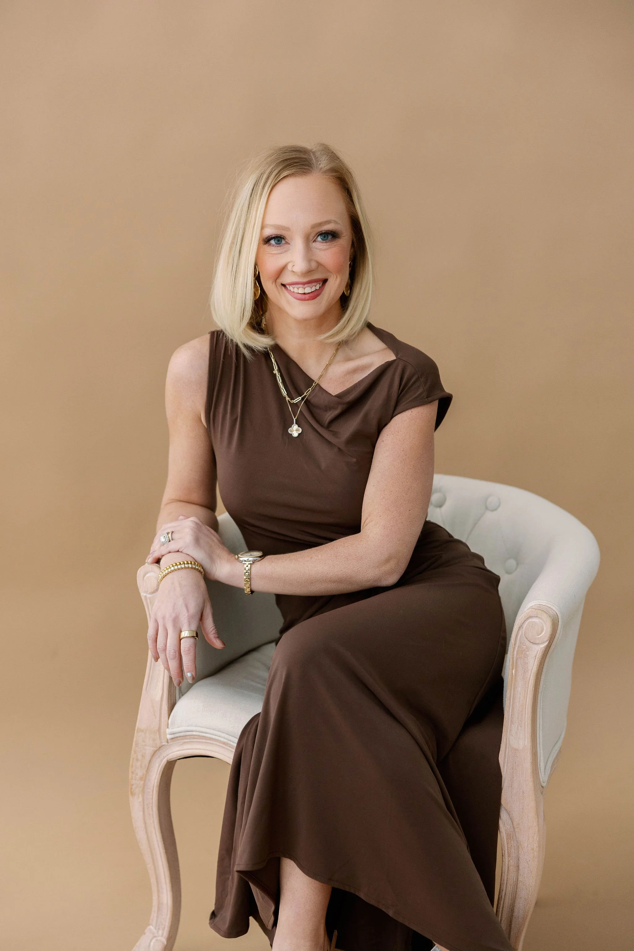
WELCOME TO ALLEIGH SOMERS PHOTOGRAPHY
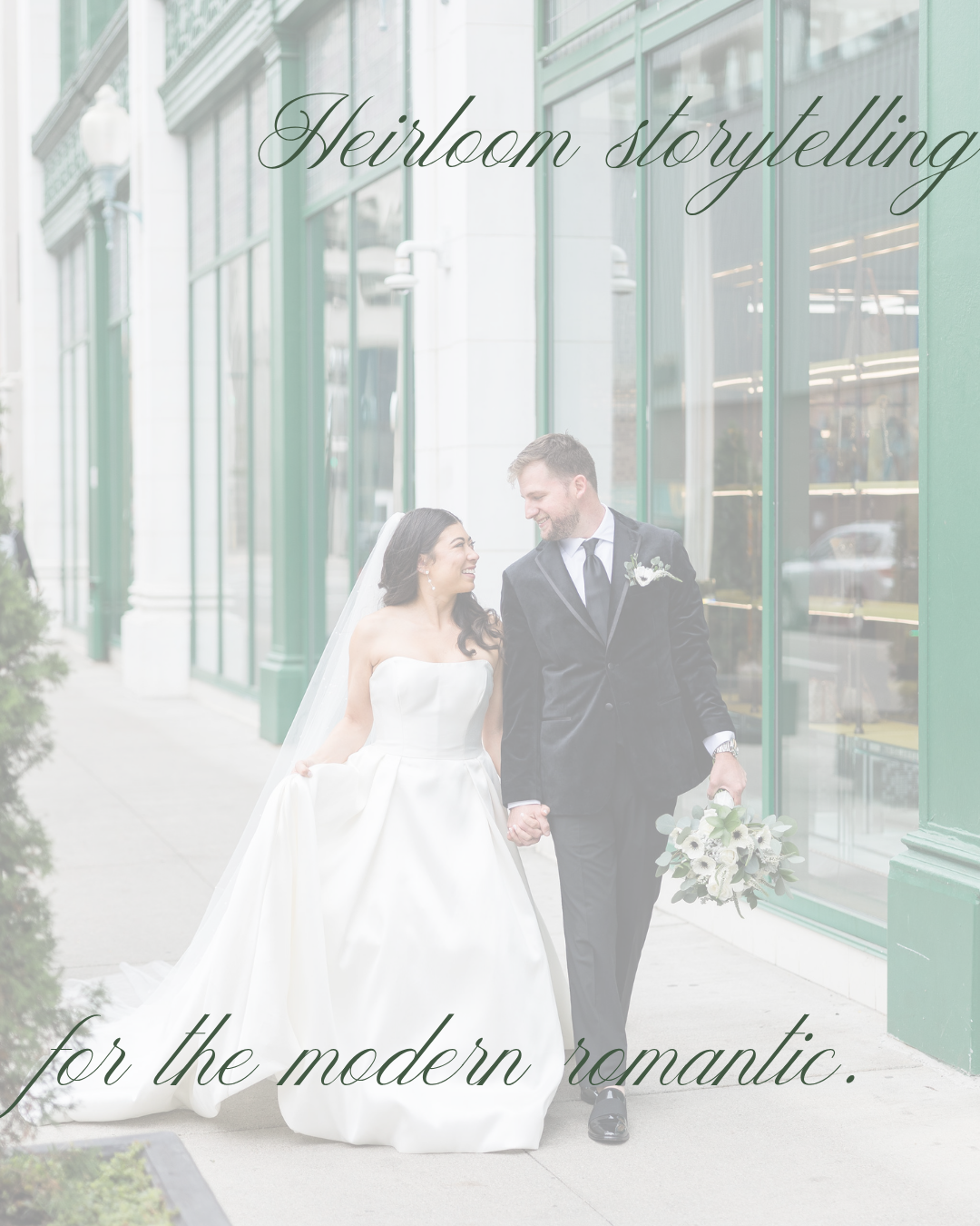
HEIRLOOM STORYTELLING FOR THE MODERN ROMANTIC: THE BRAND BEHIND ALLEIGH SOMERS PHOTOGRAPHY
A guest post from Emily Ferrara of Dssentials, the brand and web design studio behind Alleigh’s new branding and website.
For the last several months, I've been working with Alleigh on a project I knew, from the first conversation, would be one I'd remember. The brief was simple to say and harder to do: build a brand and website worthy of the work she's already making. Garden weddings. Quiet ceremonies. The kind of light most photographers describe but few actually find. The visuals existed. The story those visuals belonged to didn't, not yet.
The words we built everything around landed early in our discovery sessions:
Legacy, storytelling, modern romantic, intentional
Legacy because her photographs are designed to be passed down, not scrolled past. Storytelling because she's not documenting moments, she's building a narrative arc of a day, a relationship, a family. The modern romantic because her clients want depth and meaning without anything that veers dated or precious.
Every design decision that followed had to honor that line. When something didn't, we cut it. Here's what we built.
THE BRAND IDENTITY
The visual identity system was built in layers, each one earning its place. The goal was a brand that could live as cleanly in someone's hands (a thank you note, a print mailer, an investment guide) as it does on screen — because a brand identity that only works on Instagram is incomplete.
The color palette. Six tones drawn from the gardens, florals, and natural light Alleigh has been documenting for years. Built to cover every season, every venue type, every emotional register her work travels through.
Gardenia White — the cream base that lets everything else breathe
Sage Manor — the dominant sage, grounded and confident
Antique Stone — a softened neutral, warmer than gray
Camellia Leaf — a deeper botanical green, used as accent
Rose Vine — the romantic dusty pink, used sparingly
Iron Gate — the deep almost-black, used for type and contrast
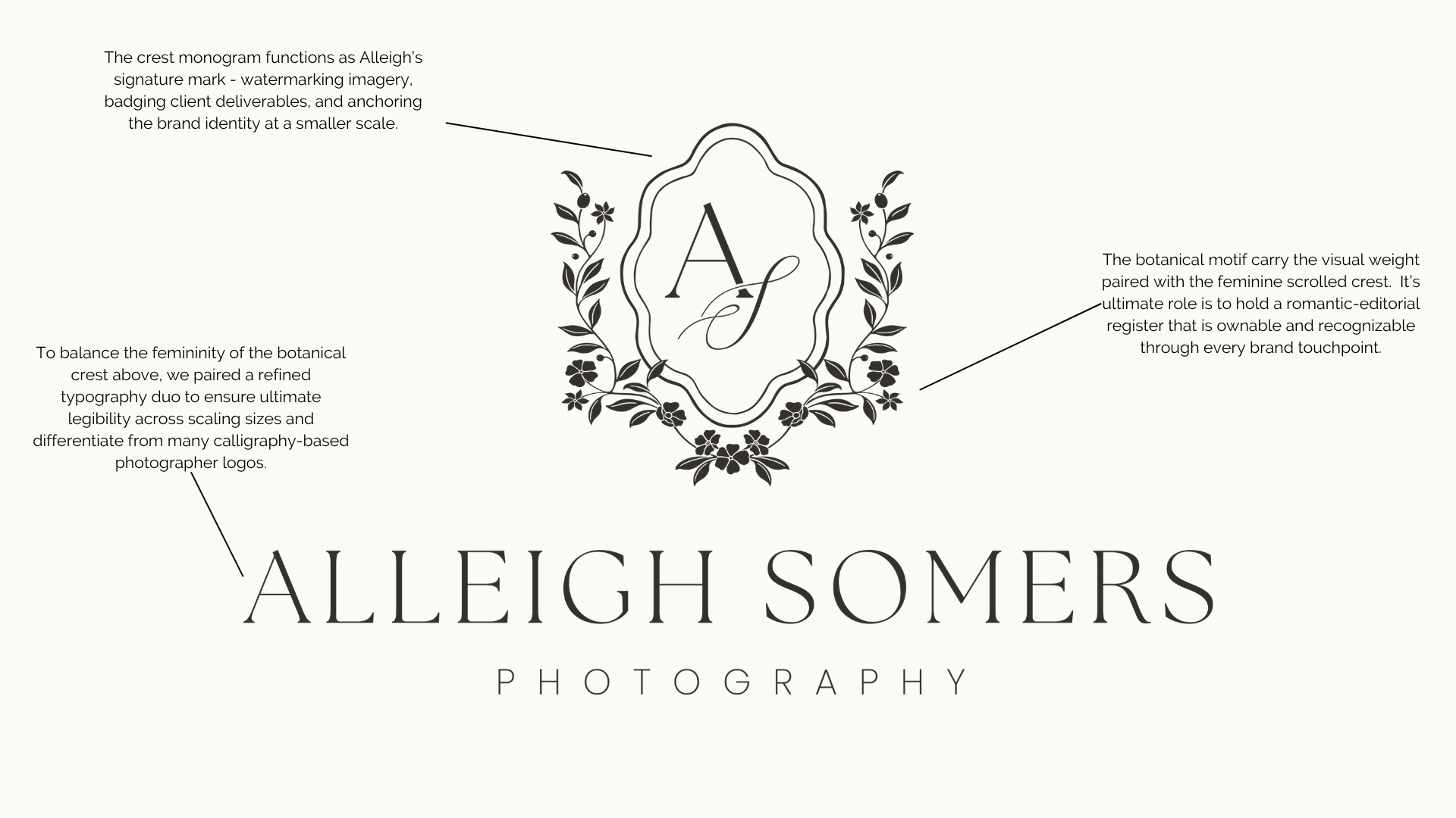
The logo system. Multiple lockups built to perform across every application, so Alleigh never has to compromise the brand mark to fit a context.
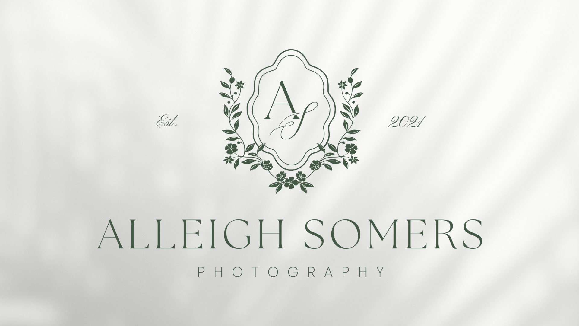
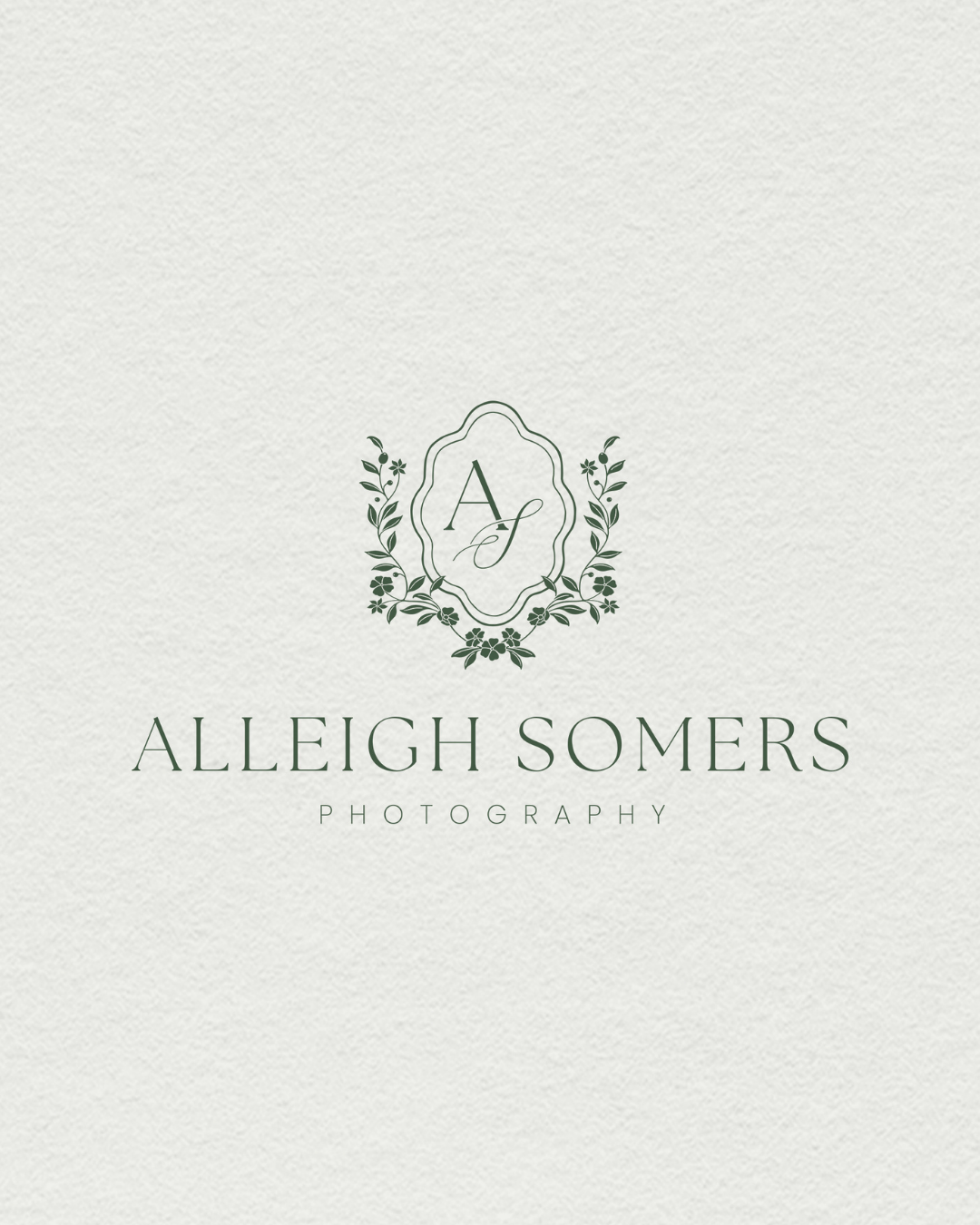
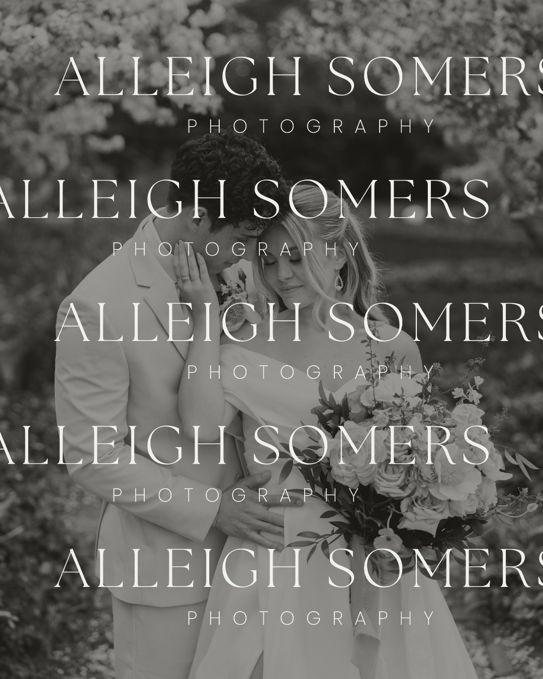
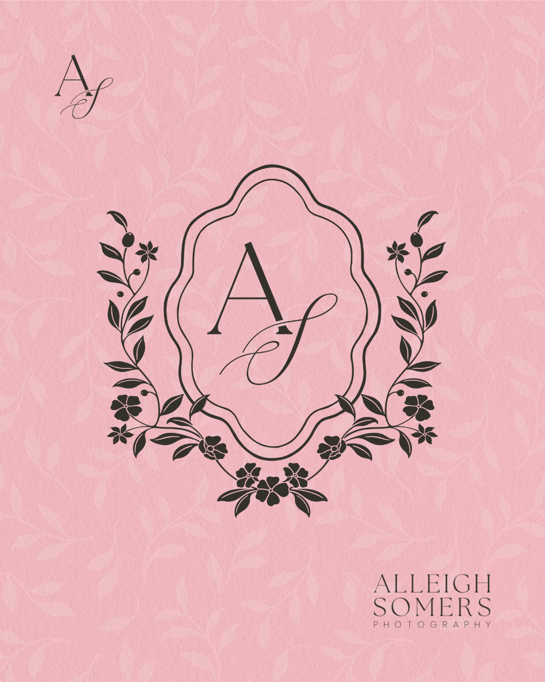
Primary lockup — the full ALLEIGH SOMERS PHOTOGRAPHY wordmark paired with a custom floral crest containing the letters AS. The ultimate manifestation of her new married last name and business growing alongside her marriage.
Floral crest submark — the crest alone, built to live independently as a watermark, social profile, or stamp.
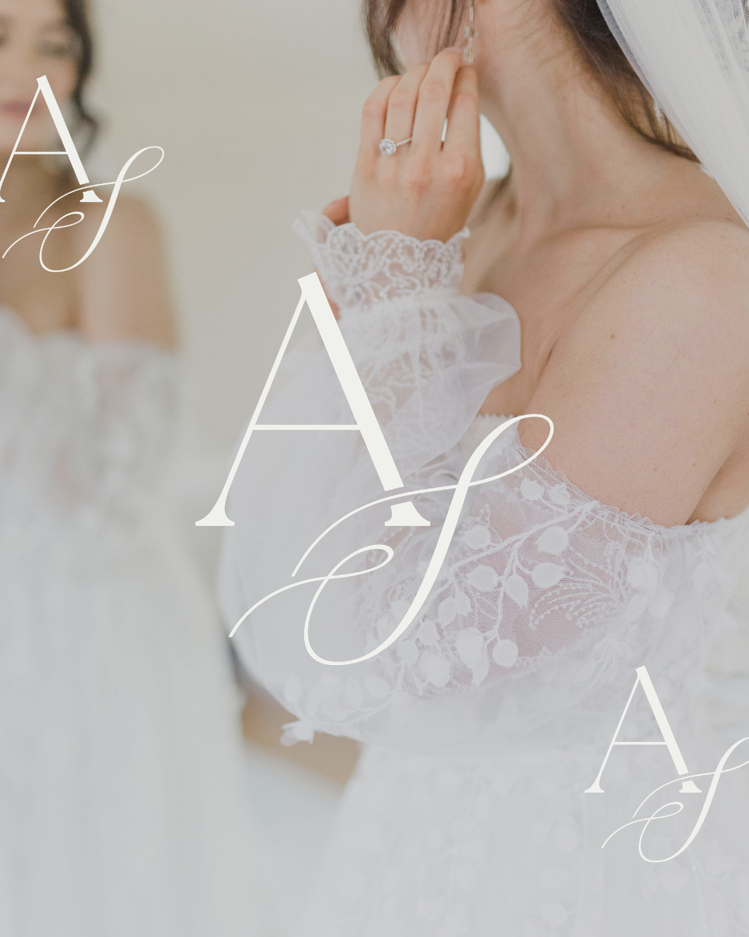
AS monogram — the cursive monogram, used as a script accent for smaller touches across digital presences.
Secondary wordmark — a horizontal-only version of the wordmark for slim spaces (footers, email signatures, print).
Wordmark stack — a vertical type-stacked version for tight square applications (Instagram, business cards).
Applications across the system. Every mark was designed to translate cleanly across formats: web applications, watermarks, social templates, print collateral. No matter the application, there’s something in this suite to allow her to brand it professionally.
The custom patterns. A romantic-botanical pattern built on a quatrefoil-inspired structure lends itself to the romantic, botanical touches without being overtly feminine. Designed for a subtle touch that adds texture to all Alleigh does. Added icons allow for delicate touches to layer on top of photography to add depth in digital applications.


THE WEB DESIGN & STRATEGY
The website is built on Squarespace 7.1 — a deliberate choice for photographers, not a default. The platform decision is the first piece of strategy in any photographer's website, and it's the one most photographers get told to make without context.
Three reasons we chose Squarespace 7.1 for Alleigh:
Integration with the photographer's tool stack. Photographers live inside a particular ecosystem — client galleries (Pixieset, Pic-Time), CRM (Honeybook, Dubsado, Studio Ninja), email, scheduling, contracts. Squarespace 7.1 integrates cleanly with all of them. Alleigh's site can connect to her Pixieset client galleries so couples move between the brand site and their private galleries without ever feeling like they've left her world.
Craft without the maintenance overhead. 7.1 gives a designer enough latitude to do real custom work — typography, layout, transitions, scroll behavior — without the developer dependency of a Webflow or WordPress build. For a service business that needs the site to last several years on its own, that's the right tradeoff.
Mobile that actually performs. Wedding photography inquiries come overwhelmingly from phones. A site that doesn't feel intentional on mobile loses inquiries before the contact form ever loads. Every page of Alleigh's site was designed mobile-first.
Site architecture. The pages were mapped directly to how engaged couples actually shop a photographer:
Home — the brand expression, the work, a high-level overview of all areas of her business with links to explore more
Experience — what it's like to work with her, what she actually delivers
Portfolio — full sessions, organized by venue type and aesthetic
About — the photographer behind the work
Inquire — a real conversation starter, not a contact form dressed up


THE STRATEGY
The strategic layer underneath. A wedding photographer's site has to do three things at once: showcase the work, set expectations for the experience, and qualify the right couples in (and the wrong ones out). Most photographer sites only do the first one. The architecture above was designed to do all three — the Experience and Investment pages do the heavy lifting that the Portfolio page can't, so by the time a couple reaches Inquire, they already know whether they're a fit.
How brand and site work together. A brand and a website aren't two things. They're one thing in two formats. The brand identity earned its right to be precious (the embossed paper, the crest, the romantic-botanical pattern). The website earned its right to be useful (the architecture, the mobile experience, the gallery integration). Together they say the same thing about her work without either of them having to shout it. That's the part of brand and web design for service businesses I most look forward to — when the visual identity and the functional system stop being two deliverables and become the same idea expressed twice.
Emily Ferrara is the founder of Dssentials, a brand and web design studio in Indianapolis. She works with service businesses — wedding photographers, real estate professionals, mortgage brokers, and creative entrepreneurs — to build brand identities and Squarespace websites that match the caliber of the work behind them.
See more of the studio's work at dssentials.com, or start a conversation about your business.